The One Thing To Avoid When Finding Your Interior Style
Vortex, rabbit hole, labyrinth, maze, web, puzzle… all terms I’ve heard my clients use to describe the tsunami of images overwhelming their project’s concept direction as they scroll daily.
Cue Googling what the most popular design styles are and taking standardised style questionnaires… after which, you still don’t feel like they’ve quite nailed you?
I have a love hate relationship with style genres and quizzes – they’re a great starting point to set you on your way to “discovering” (key choice of word there) your ‘look’ and communicating it, but sometimes it’s not as simple as putting a label on it, because we’re constantly evolving… and so therefore, is our design style, look or aesthetic.
Between you and me, these days I never come across one room that is purely ever just one genre. As a self-proclaimed hybrid myself (Japandi/Modernist with a bit of Minimalism/Brutalism on the side – but look, let’s just say I’m in an open relationship with style), I completely understand what it’s like to not fit into a pre-defined box, and that’s before we even introduce the quirks of your individual space. Because what you like, might not quite fit with what you’ve got – so how do you reach clarity on a direction that in the end, resonates with you and doesn’t just feel like you’re checking a box?
In a world where fast consumerism still rules, it’s understandable that we want our style figured out from day dot too – and following hashtags and boards is the internet’s answer to getting there fast… so let’s just unpack that for a second.
Breaking down the social media algorithm
It’s the next best bit of advice we give clients – hitting up Pinterest and Instagram with your style genre keywords and saving down anything that’s jumping out at you can be great if you are confident in your style, but what if you’re not?
You may or may not be familiar with social media algorithms – but basically, when you like or engage with something, the all-knowing Big Brother powers of the universe take note, so they know how to present your feed to you, and will start to push you similar content which they suspect you’ll like.
Wondering why Boho Coastal keeps appearing on your feed? You probably liked an image with pampas grass – which can fit with any number of other interior styles from Hamptons Coastal, to Contemporary Farmhouse, to French Provincial – but now the algorithm’s taken you down hippie lane. You can see where I’m going with this…
And let’s just say that because I’m a design fanatic and working across many different aesthetics for my clients, the algorithm gets a little confused with me – but that’s just how I like it and need it to be!
Because sometimes all it takes is a couple of likes for social media to pigeonhole you into an aesthetic that’s ‘on-trend’ and you miss out on discovering a heap of content – and that’s not a good thing if you’re working in the design industry, or you’re not sure on your ‘look’ in the first place.
The wonderful thing about the algorithm though, is if you’re sure about and confident in what you like and the components that make up that general aesthetic or ‘look’, it opens up Pandora’s box of inspiration.
Get confident in your ‘look’
I’m going to preface this section with a few quotes to drive home the message: “Good things take time”, and “Rome wasn’t built in a day”, “Why rush something that’s going to last forever”, and…
Do I need to keep going?
Believe me, I get it – as a designer needing to be across many styles or genres, it’s completely understandable to reach a point where you just can’t look at anything else, and you’re begging for someone to just tell you what to do!
But regardless:
My number one thing to avoid when finding your interior design style is: don’t try to label or pre-define your style in the first place!
Because you potentially close yourself off to all manner of inspiration.
Honing your own aesthetic is a journey and you’ll have many influences that direct this over the course of your life – but where to start ‘discovering’ you ask?
Here’s what I tell my clients…
1. Explore Your Feelings
If you’re finding it hard to even identify a starting point, a game I like to play before we even get friendly with social media is – how has a space, or element in a space, made you feel?
Hotels, museums, art installations or galleries, restaurants, office foyers, others’ homes, pockets of your own home – do you get a sense of inspiration, calmness, discontent, invigoration, refreshment, awkwardness, warmth, or coolness when you’re in them?
Why do you think that is? Is there an element in that space that was memorable or frustrating? And what other elements made you take notice of it?
Because as well as an overall ‘feeling’ or mood and the standout elements that captured your attention, this exercise will usually help you identify other elements you might need to consider or avoid including to help you create that same feeling of contentment or otherwise.
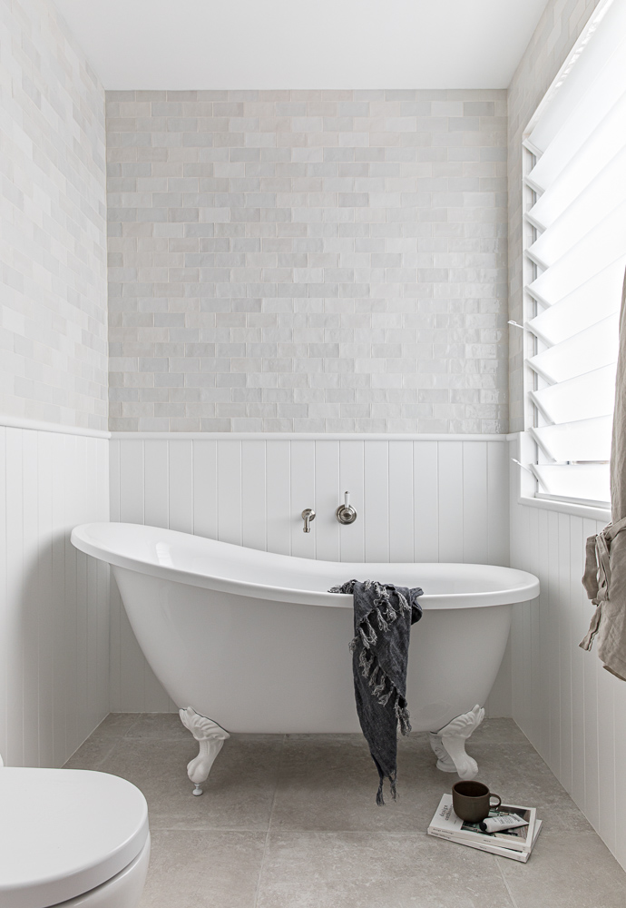
2. Find Your Keywords
Once you’ve got a few spaces that have made you feel content, take note of their name and research their designers and architects.
Read up about their architectural influences and the inspiration that directed their makers – because even typing in the name of a hotel, restaurant or Googling who designed these spaces and their key elements will give you your first keywords to throw into social media.
You’ll hopefully get a sense for their design style too, but at this point, it’s also probably pertinent to do a little digging into top design genres so you understand what you’re looking at moving forward – who knows, you might also find another style (and therefore keyword) that catches your eye!
Googling top interior design or architectural publications and following those that resonate with you on social media can also be helpful (I’ve profiled a couple of my faves here), particularly for what comes next.
3. Inspiration Imagery
You’ll already have a couple of these if you’ve saved some from the spaces and resources from above – but now my friend, you’re ready to really delve into the wonderful world of Pinterest and Instagram: follow those boards and hashtags to your heart’s content! And then start your own Boards and Collections to chronicle examples complete with notes on why they jumped out at you.
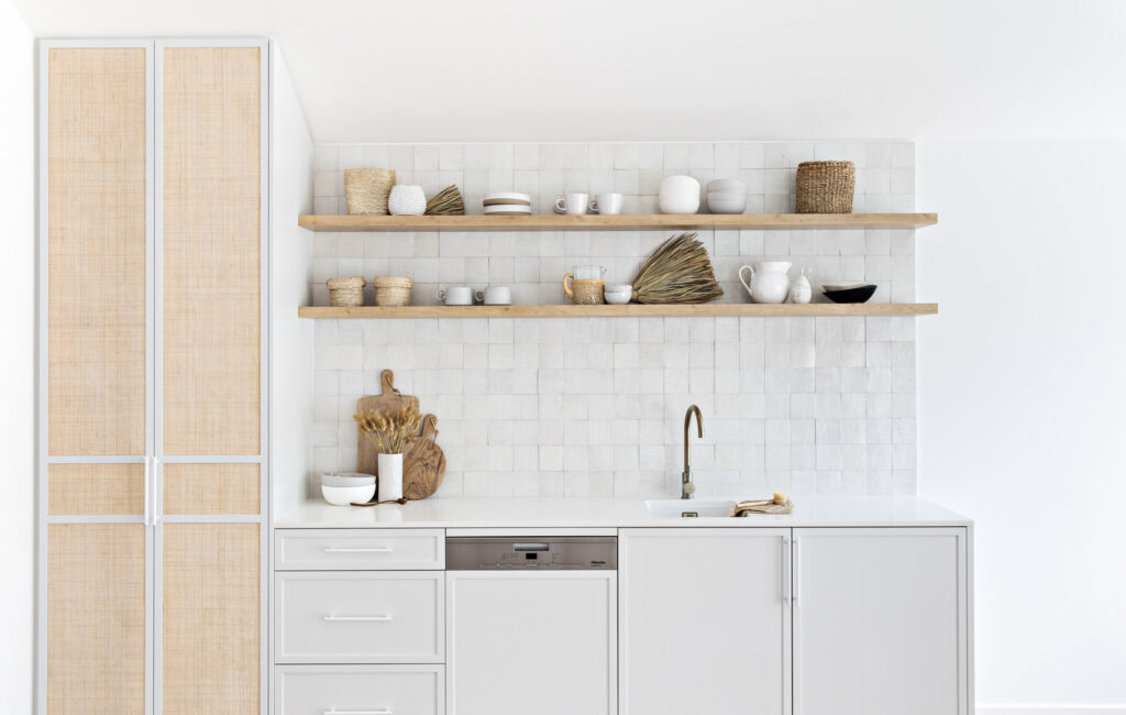
Starting to define a concept direction
It can be overwhelming trying to sift through and connect your inspiration images into a cohesive concept direction, but here’s a few tips:
1. Refine
If you’re not liking at least 75% of all elements in one particular image singled out, toss it and refine your hundreds of images to 20-30.
2. Categorise
You should be starting to see better flow in your imagery, so now for the nitty gritty. What are the most common elements? Look closely – what is it that you truly like about an image and that you also see appearing across others? The exposed ceilings that gave a sense of ‘grandeur’, the clean minimalism that felt ‘tidy’, the cottage core eclecticism that felt ‘cosy’? Is it a texture, layout, plant, pattern? The oak cabinetry, flooring and tables? The colour blue?
3. Don’t compromise
If your inspiration imagery doesn’t give you the same feeling as the spaces you identified at the start, they probably shouldn’t be in your final collection.
4. Fast Five
While it probably wasn’t fast to reach this point, hopefully from the above exercises you’ll be able to identify the top five things you want the space to be or feel like, and then your top five non-negotiables to bring into your home to achieve this.
In closing – I know this sounds counter-intuitive, but it really is the most important point: remember, anything you love will remain timeless and never go out of style in your eyes, so you do you boo, and try to have fun while you’re at it!
A discussion about your ‘look’ is one of the first things we cover in your Design Consultation with Kahli Jayne Designs, so if you’re still having trouble wading through all those Pinterest and Instagram images to find clarity and move forward – reach out.

